
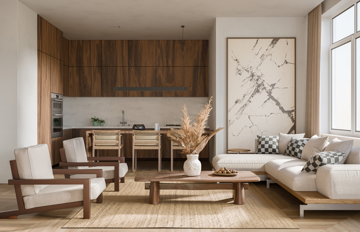

The era of purchasing an entire matching bedroom suite or a coordinated five-piece dining set directly from a showroom floor has passed. While matched furniture was once marketed as the pinnacle of domestic order, it often produces an interior that feels sterile, rigid, and oddly commercial. In contrast, the most inviting, architecturally compelling homes embrace a collected sensibility, where furniture and architectural finishes look as though they evolved naturally over decades.
Achieving that layered, lived-in aesthetic requires mixing different wood finishes within a single space. For many homeowners and designers, however, the process triggers genuine anxiety. Wood possesses distinctive grains, varying saturations, and complex undertones that can easily clash if paired carelessly. A room with uncalibrated timbers can rapidly shift from curated to chaotic.
Fortunately, blending wood tones is not a matter of luck. It is governed by reliable visual principles that balance contrast, temperature, and distribution. By mastering a few core techniques, you can combine walnut, oak, maple, and mahogany with total confidence.
Establish a Dominant Anchor Tone
Every well-designed room requires an architectural baseline. When mixing wood finishes, your first priority is identifying or establishing the dominant wood tone, which should account for roughly sixty to seventy percent of the total wooden surface area in the room.
In most homes, the dominant tone is dictated by permanent architectural elements: hardwood flooring, exposed structural ceiling beams, wood-paneled walls, or custom kitchen millwork. If your room features carpet or tile, the anchor tone will typically come from your largest furniture investment, such as an eight-person dining table, a massive media console, or a substantial credenza.
Once your anchor is set, treat it as the visual foundation against which all secondary timber selections are evaluated. Every subsequent wood piece—whether an accent side table, a set of dining chairs, or a picture frame—will either complement or contrast with this primary material. Without a clear anchor, multiple wood pieces will compete for dominance, creating visual restlessness that tires the eye.
Decode the Undertones
The single most common mistake in wood mixing is ignoring undertones. Wood is an organic material with nuanced color temperatures beneath its surface. Even when two pieces of wood are stained to a similar medium-brown value, one may lean warm while the other leans distinctly cool. If their undertones fight, the entire room will feel discordant.
To determine a wood piece’s true undertone, examine it in natural indirect daylight. Holding a pure white sheet of paper against the surface quickly exposes the underlying bias:
-
Warm Undertones: Woods like cherry, warm walnut, unstained alder, mahogany, and honey oak carry yellow, orange, red, or golden hues. They introduce comfort, vibrancy, and traditional warmth.
-
Cool Undertones: Bleached white oak, weathered gray driftwood, ash, and cerused finishes display muted gray, taupe, or soft silver-blue undertones. These read as crisp, architectural, and modern.
-
Neutral Undertones: Natural mid-century walnut, untreated white oak, and light natural maple feature muted, earthy brown undertones that balance warm and cool spectra.
As a general rule, maintain a consistent undertone family across the disparate species in a room. You can effortlessly pair a pale, butter-yellow Scandinavian pine with a rich, amber-toned antique teak because both share warm, sunny bases. Similarly, a cool charcoal-washed oak coordinates naturally with a pale, gray-washed ash. Neutral woods provide universal utility, acting as a bridge that can sit comfortably alongside either warm or cool selections.
Aim for High Contrast Instead of Near Matches
One of the most counterintuitive rules of interior styling is that nearly identical woods are harder to combine than starkly different ones.
When you place two wood finishes together that are slightly off—for instance, pairing a red-toned mahogany dining table with slightly cooler cherry wood chairs—the eye registers the subtle mismatch as an unintentional error. It looks as though you attempted to match the pieces and failed.
Instead of hunting for near matches, embrace high visual contrast. Pair a very pale wood with a very dark one. A raw, blonde white-oak console table set against dark-stained espresso hardwood floors looks deliberate, sharp, and graphic. Similarly, pairing an ebonized black ash dining chair with an unstained honey pine dining table creates intentional tension that highlights the unique silhouette of both pieces. Contrast transforms separate furniture pieces into distinct architectural sculptures rather than competing surfaces.
Balance Grain Scale and Surface Sheen
Color and value are only half the equation; texture and sheen play an equally vital role in how wood finishes interact.
Managing Grain Scale
Wood grain patterns vary dramatically across species. Red oak, ash, and zebrawood feature open, prominent, and sweeping cathedral grain patterns that make a loud visual statement. Conversely, maple, birch, and modern-milled walnut present tight, closed, and exceptionally subtle graining.
If every wooden item in a room boasts an aggressive, wide grain, the space can feel visually crowded. Pair an expressive, wide-grained wood piece with a fine, quiet grain to let each breathe. A live-edge table with wild figure looks best when anchored by sleek, linear, tight-grained chairs.
Standardizing the Sheen Level
While your wood colors and grain patterns should vary, your surface sheen should remain relatively uniform. Sheen dictates how light reflects off a surface. If you combine high-gloss polyurethane antiques with raw, open-pore matte timber and low-luster oil-rubbed consoles, the variation in light reflection can make the room look disheveled. Sticking to a consistent satin, eggshell, or matte finish across your different wood elements creates an underlying harmony that quietly knits the room together.
Repeat and Distribute Across the Space
A mixed wood design falls flat when an accent tone appears only once. If you introduce an oxidized black oak stool into a room otherwise dominated by warm honey tones, the isolated piece will look like an errant castaway.
Follow the rule of repetition. Every wood tone in the room should appear at least twice. If you have an ebonized coffee table, balance it with ebonized picture frames on the far wall or a blackened wood bowl on a side console. This repetition teaches the subconscious mind that the inclusion was planned.
Furthermore, distribute wood tones throughout different elevations and planes. Do not cluster all your dark walnut pieces on the left side of the room while leaving the right side exclusively light oak. Disperse the tones across the floor plane, mid-height seating, eye-level shelving, and higher architectural elements to encourage the eye to move smoothly across the entire space.
Create Visual Buffers with Textiles and Mixed Materials
When two challenging wood finishes must occupy the same immediate footprint, physical separation is your most effective tool. Placing a wood dining table directly onto a hardwood floor of a conflicting shade creates direct friction along the contact line.
Introduce tactile buffers to break up direct wood-on-wood collisions. Layering a large wool or natural-fiber jute rug underneath a dining table visually isolates the furniture legs from the floor planks, resolving tone conflicts instantly.
Non-wood materials provide the same restorative pause. Break up continuous expanses of timber with stone countertops, plaster walls, ceramic vessels, and glass surfaces. Woven elements like cane, rattan, and leather provide organic warmth that complements wood while softening the hard transitions between timber varieties. Similarly, incorporating metal hardware—such as unlacquered brass, blackened iron, or brushed nickel—draws the eye away from wood borders and injects depth into cabinetry and furniture groupings.
Embracing mixed wood finishes frees you from the artificial confines of coordinated furniture packages. When approached with a clear dominant tone, harmonized undertones, purposeful contrast, and soft textural buffers, mixing woods transforms an interior into a rich, timeless environment that reflects personal curation over assembly-line convenience.

Comments are closed.