
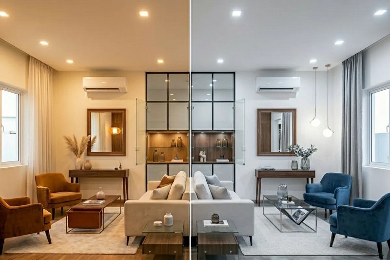

Selecting a white paint for interior trim seems straightforward until you are standing in front of a display rack facing several hundred distinct swatches. Trim serves as the architectural outline of a home. It defines baseboards, window casings, crown molding, and doorways, creating the visual boundary between wall surfaces, flooring, and natural light sources. Choosing the wrong white can throw off an entire design scheme: a white that is too cool can make a living room feel sterile or turn surrounding colors muddy, while an overly warm white can read dingy, yellowed, or aged against crisper finishes.
Understanding the balance between warm and cool whites comes down to undertones, light exposure, and the permanent architectural elements in your space. Once you know how these variables interact, you can select a trim color that brings cohesive polish to your home.
Decoding the Undertones: What Gives White Its Temperature
Pure white paint—one containing no tint whatsoever—is rarely used on residential trim because it can feel harsh and blinding under direct sunlight. Almost every commercial white contains trace amounts of pigment that establish its color temperature.
Warm Whites
Warm whites contain microscopic additions of yellow, red, orange, or beige pigments. These undertones soften the edge of the paint, creating an inviting, gentle, and classic aesthetic. When applied to trim, a warm white provides a seamless transition in traditional, transitional, or historic homes where woodwork features detailed profiles and soft curves. However, if a warm white leans too heavily into yellow pigments, it risks looking like aged oil paint or nicotine discoloration under poor lighting.
Cool Whites
Cool whites are mixed with tiny amounts of blue, green, gray, or violet. These tints create a crisp, sharp, modern edge that reflects light with high clarity. Cool whites are staples in contemporary, coastal, and minimalist interiors where crisp lines and high contrast are desired. The primary risk of a cool white is that it can quickly feel clinical or icy, particularly in rooms lacking abundant natural warmth.
Evaluating Your Natural and Artificial Light
Paint does not have an inherent color independent of the light that hits it. Before looking at color strips against your walls, examine the directional exposure of your windows and the color temperature of your light fixtures.
Natural Light Exposure
The compass direction your windows face dictates the temperature of natural daylight throughout the day:
-
North-facing rooms receive indirect, cool, slightly bluish light. Applying a cool white trim here compounds that chilliness, often casting a dull, bluish-gray shadow along baseboards. Warm whites counteract this northern coolness, adding subtle warmth and keeping the space grounded.
-
South-facing rooms enjoy intense, warm, golden sunlight from morning until late afternoon. These spaces can accommodate cool white trim beautifully, as the warmth of the daylight prevents the cool undertones from looking sterile. Conversely, a warm white in a southern room can skew overly yellow or creamy under intense afternoon sun.
-
East-facing rooms receive clear, warm light at dawn that cools considerably as the afternoon progresses. A balanced white with neutral undertones or a very delicate warmth tends to perform most consistently throughout the shifting daylight.
-
West-facing rooms start the day with subdued, cool light and end with saturated, fiery orange light. Cool whites help temper the intense heat of late-afternoon western light, while warm whites can look fiery during sunset.
Artificial Lighting and Kelvin Ratings
The bulbs inside your fixtures dictate how your trim reads after sundown. Light bulb color temperatures are measured on the Kelvin scale:
-
2700K (Soft White): Casts a heavy amber-yellow glow. This enhances warm whites but can make cool whites look sickly or dirty by clashing with their blue bases.
-
3000K (Warm White): Provides a clean, balanced light that flatters both warm and neutral trim colors without distorting their undertones.
-
3500K to 4000K (Neutral to Cool White): Delivers clean daylight-adjacent illumination. This works exceptionally well for cool whites and modern spaces, but it can wash out subtle warm whites, stripping away their richness.
Coordinating Trim with Walls, Cabinets, and Flooring
Trim rarely exists against bare drywall alone; it directly abuts wall paint, cabinetry, tile, and flooring. To achieve visual harmony, your trim color must respect the undertones of these fixed elements.
Matching Wall Undertones
A reliable rule of thumb is to keep your trim temperature aligned with your wall temperature. If your walls are painted a warm greige, creamy linen, or earthy terracotta, warm white trim creates an organic, cohesive bridge. Pair cool whites with crisp blues, slate grays, emerald greens, or cool jewel tones to prevent the trim from looking muddy by comparison.
If you desire high contrast—such as dark charcoal walls framed by bright white casing—ensure the white is neutral or very subtly cool. A distinctly yellow-warm white framed against deep charcoal or jet black can create an unintended vintage look that undermines modern styling.
Fixed Hard Finishes
Paint can be redone in a weekend, but hardwood flooring, stone countertops, and kitchen cabinetry are permanent investments.
-
Warm wood floors (red oak, walnut, honey pine) pair naturally with warm or neutral whites. A stark, cool white can highlight floor grain in an unflattering way, making the wood look artificially orange.
-
Cool wood floors (ash, white oak with raw or gray stains) or gray stone tiling coordinate effortlessly with cool or balanced white trim.
-
Kitchen cabinetry requires special attention. If your cabinets are painted a factory white, your trim should never clash with them. If your kitchen cabinets are a cool, bright white, choosing an off-white or warm cream for the adjacent baseboards and door casings will make the trim look discolored and unfinished.
The Role of Sheen in Perceived Color
Color perception changes with the finish you choose. Wall paint is typically specified in flat, matte, or eggshell, while trim paint requires durable enamel formulations in satin, semi-gloss, or gloss.
Higher-sheen finishes reflect more light back into the room. This surface reflectivity accentuates white paint’s undertones and often makes colors look a half-shade lighter than they appear on a flat paper swatch. A semi-gloss warm white will bounce ambient room colors differently than an eggshell wall of the same shade. If you are using the same white paint color across walls and trim—a popular technique for making spaces feel larger—relying on a flat wall finish paired with a semi-gloss trim creates a subtle, tactile difference without any risk of clashing undertones.
Testing Your Choices Before You Commit
Never purchase gallons of trim paint based on a small manufacturer swatch viewed in a store under fluorescent commercial lights.
Purchase sample pots of two warm whites, two cool whites, and one neutral white. Paint large samples on rigid white foam board or scrap pieces of primed trim, applying two coats for full opacity. Move these samples around your home over several days. Check them against your baseboards next to your hardwood flooring, hold them against your kitchen cabinets, and place them along window frames where direct daylight breaks across the surface. Evaluate how they look at 8:00 AM, 1:00 PM, and under your lamps at night.
By testing in your home’s unique light and pairing your selection with existing architectural materials, you ensure your trim provides a clean, intentional finish that enhances every room in your home.

Comments are closed.